Dave Dye is true “art director’s art director”. Through his career he’s won everything. The variety of his work and the visual techniques he employs to squeeze every ounce of juice from an idea are frankly unparalleled.
Dave Dye is an erudite presenter, and a pretty decent writer (for an art director, that is). His blog, Stuff from the Loft, is worth a visit from time to time. It’s a combination of his musings on the latest issues in the industry, as well as interviews with great creatives talking about their best work. It’s updated infrequently, though. He’s a busy man.
A visit to his blog, however, does reveal a weakness. He hasn’t managed the transition to digital / social / integrated as well as other great creatives such as David Droga. But for a period of 20 years or more, Dave Dye was incredibly productive and set a visual standard that every art director in the world aspired to.
In this article, we are celebrating his art direction. Which is truly great. His art direction of posters and print ads are peerless. And posters, in particular, are still very relevant to a modern creative’s craft. There is much to learn from Dave Dye.
"Mary Poppins sang that a spoonful of sugar helps the medicine go down. Think of Art Direction the same way" - Dave Dye
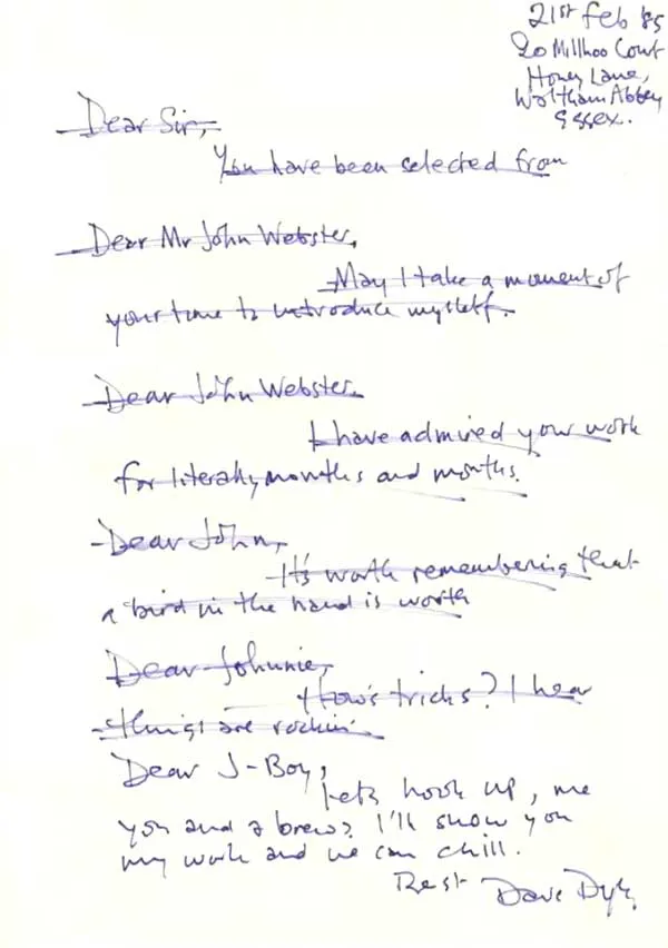
Dave Dye tells a great story about getting his first art direction role in the advertising industry. Back in the days before computers.
Every job application had to be personally typed out, accompanied by a mini portfolio that would have to be hand drawn and colored every single time. And nothing worked. The rejection letters piled up.
But then he had an idea. He had always struggled with the correct way to address the people he was writing too. Was ‘sir’ too formal? Should he address them as ‘Mister’? He decided to make that dilemma into his application letter. He hand wrote it every time, and suddenly he got a bunch of interviews. And soon enough, a job as a junior art director. The letter he wrote is below.
Unlike other great creatives like John Hegarty and David Droga, both boy wonders who went onto greater things, Dave Dye took longer to bloom.
Dave Dye managed to get his first job at an unremarkable agency. For the first few years, he struggled at long forgotten agencies named Cromer Titterton, Edwards Martin Thornton, Delaney Fletcher, and Delaney Bozell.
Everyone progresses at their own pace. As long as you keep improving and seeking out opportunities, you can find greatness at any age.
His early years are a bit of a desert. But he kept learning, and striving. And eventually he made his way into an agency that gave him the kind of opportunities he’d been craving. One of the top agencies in the UK of that era, Simons Palmer Denton Clemmow & Johnson.
He landed at this top advertising agency just as it was about to implode. Within the year, the creative partners of the agency had been kicked out. It wasn’t the place of golden creative opportunities he’d been hoping for anymore.
So he jumped ship to Leagas Delaney. And it is here that the story of Dave Dye really begins. Because Leagas Delaney was helmed by Tim Delaney, who is also one of the all time greats. At last he had a creative leader that allowed him to spread his wings and really explore his talents.
Dave Dye worked at Leagas Delaney for a bit. He then moved through the cream of uk ad agencies as head of art and creative director (Abbott Mead Vickers, BMP DDB and more) until joining with his long time copywriting partner Sean Doyle to create Campbell Doyle Dye – his own agency.
That agency fell apart, but he still wanted his name on the door – so the next project was Dye Holloway Murray.
Mother was the next project. Joining in 2013 as head of art.
He now works as part of his own creative consultancy, called Thingy, as well as a new agency called Love and Fear – established in 2019.
He has designed the D&AD annual publication, not once, but twice. As far as I know, he is the only Art Director that’s done this. I will tell the story of his second design, the 50th anniversary design, later in this article.
Dave Dye’s ability to create dynamic looks for his campaigns are unparalleled. He rarely repeats himself, and always finds a way to make his work stand apart from the product’s competitors, as well as the crowd.
But he is far more than a stylist. He is a cerebral art director that comes up with campaign ideas of his own and finds compelling ways to solve business problems in lateral and effective ways.
Great stylistic art directors have often found their careers limited once they make it to head of art. They can spend so much time focused on the minutiae that they can find it difficult to grapple with the grander challenges. This is not the case with Dave Dye.
"Few people see what's right in front of their nose. They are too busy being clever" - Dave Dye
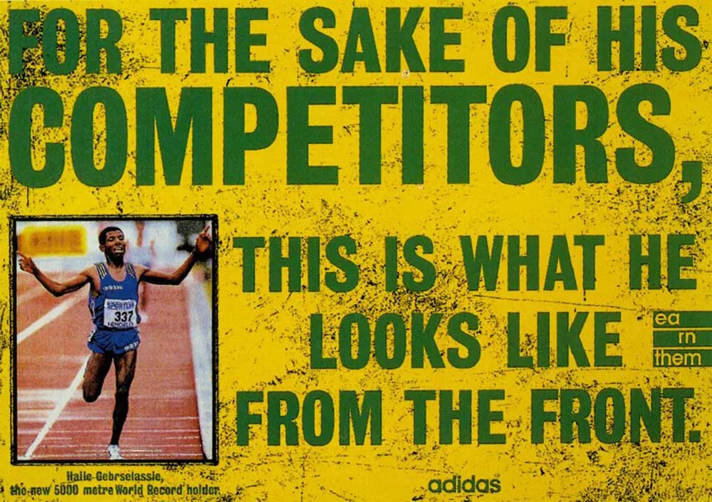
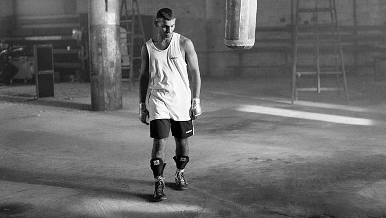
Dave Dye made many, many campaigns for Adidas. They really were the first campaigns that made the industry pay attention to him. They are all beautifully crafted and well thought through.
The first campaign he made was the ‘Yellow’ campaign. He was new to the brand and the agency, so he didn’t have the opportunity to rock the boat. He was dissatisfied because he felt that the look overwhelmed the photography, and that they were an attempt to look like Nike.
To be fair, they hold up well today. Even though they weren’t what he wanted to do, he still brought his A-game with his Art Direction. The craft is self-evident.
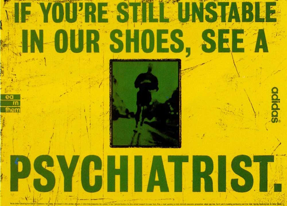
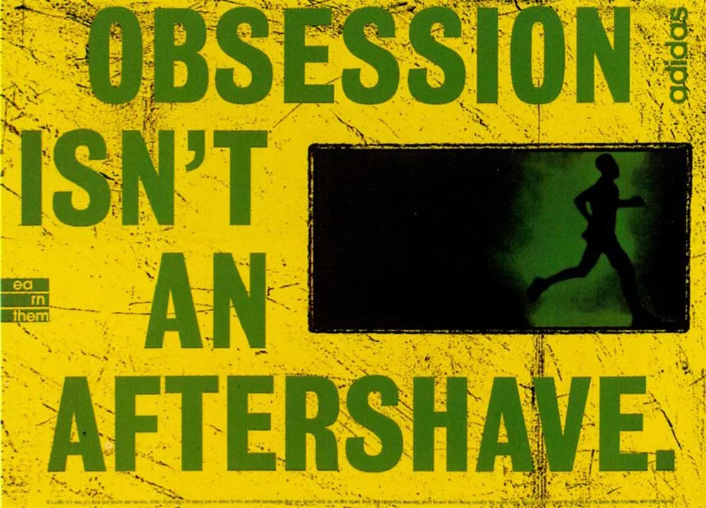
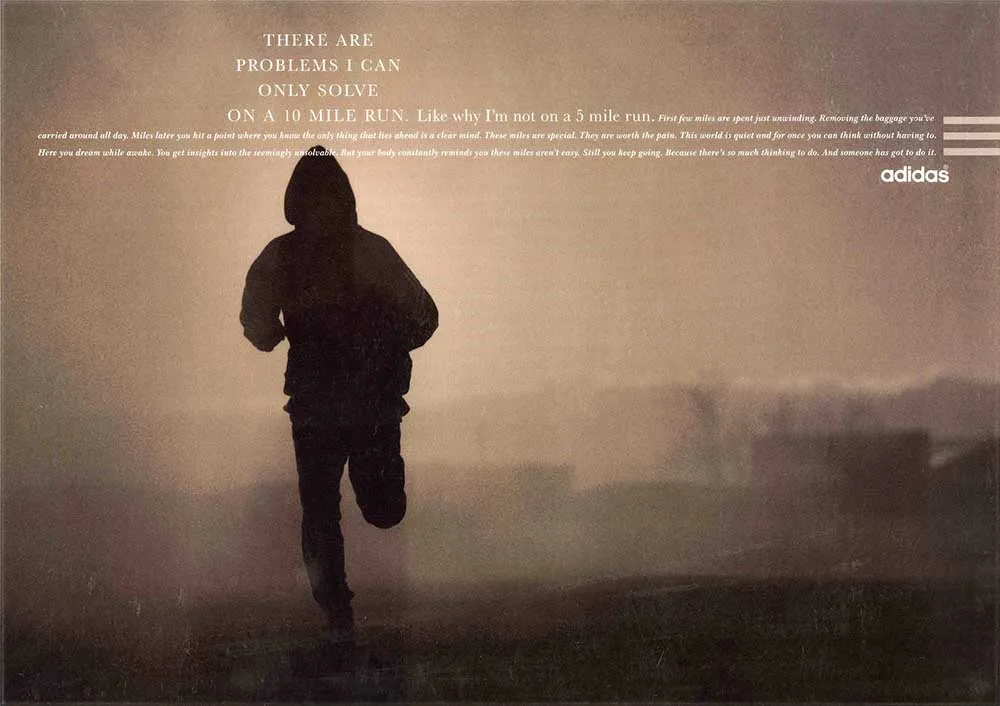
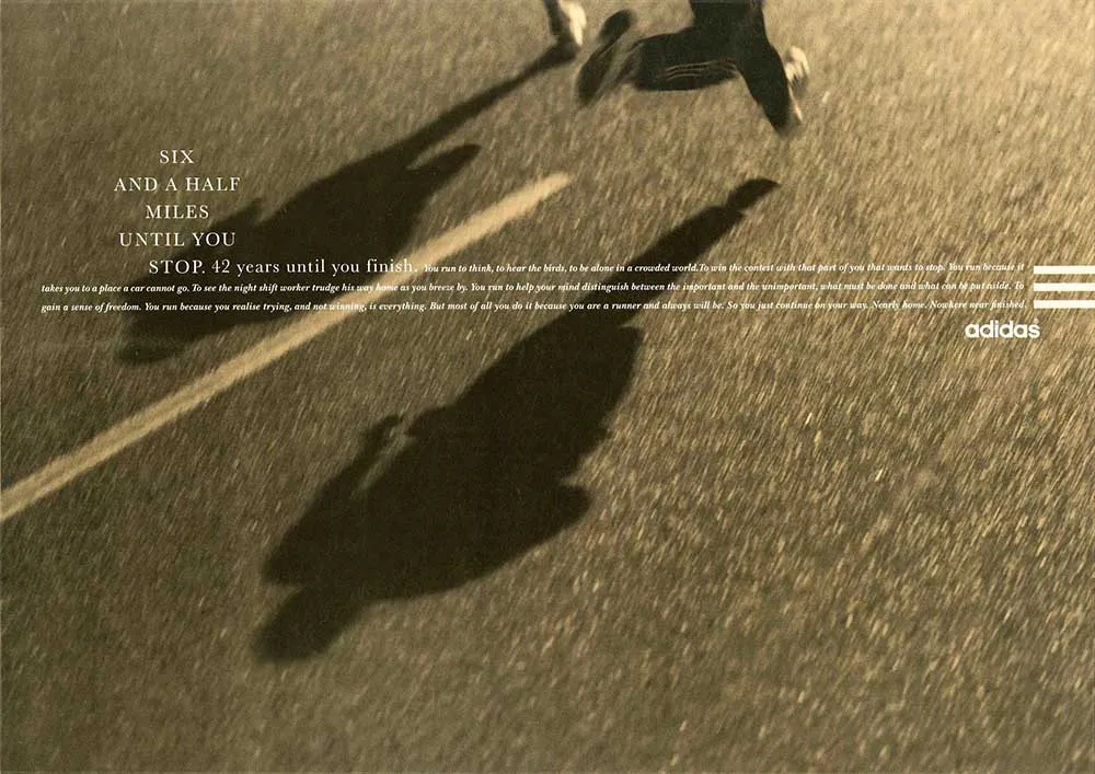
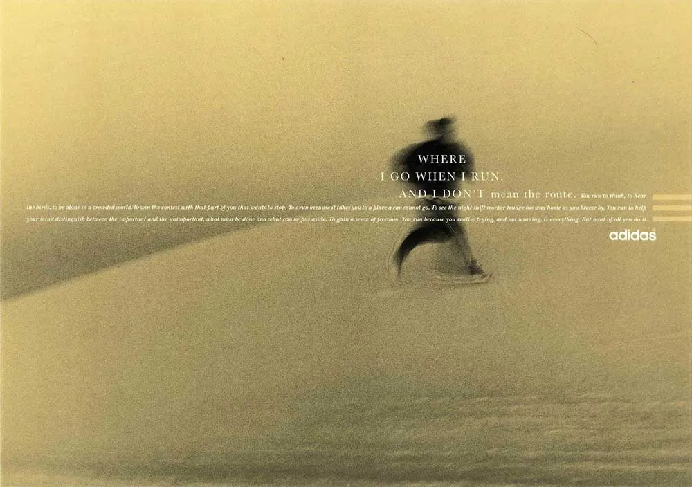
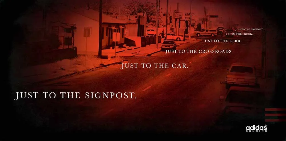
Soon afterward, the head of the agency, Tim Delaney, wrote some Adidas print ads that Dave was asked to Art Direct. He’d written ads that were tonally very different from the previous work. He’d written more introspective lines, essentially runners’ thoughts on running.
This was Dave Dye’s great opportunity. And he made the most of it. He discarded the typical look that defined athletic products, and styled the ads in a completely new and distinctive way.
Photography wasn’t in your face. The runners weren’t necessarily identifiable. They were designed not to celebrate the greatest runners, but to empathise with people who ran for their own personal reasons.
For the time, and the product category, these ads were revolutionary. I have included three, but there were many more of these. There were some great lines, and Dave Dye brought each of them to life in the best possible way.
This is one of the greatest examples of how Dave Dye elevated himself above being considered a ‘stylist’. He also came up with ideas and wrote lines.
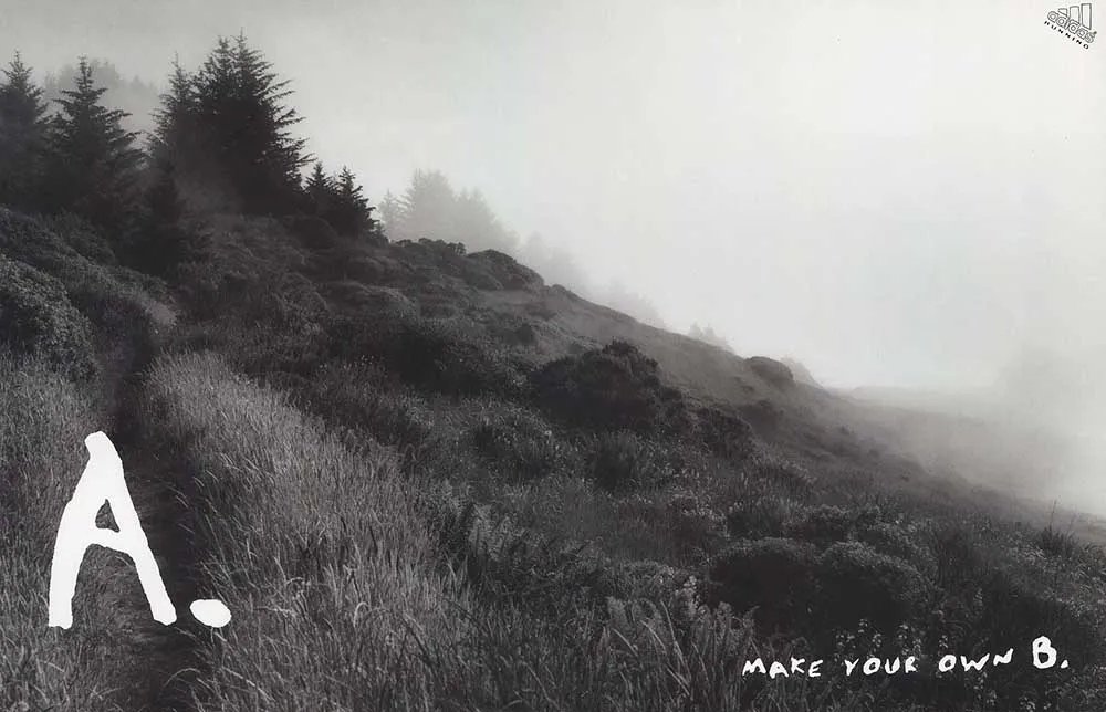
There was one thought that struck him and stuck around. The idea that when people run, they have an inner dialogue going on that urges them to keep on going. Here is the first expression of the idea that he showed the agency.
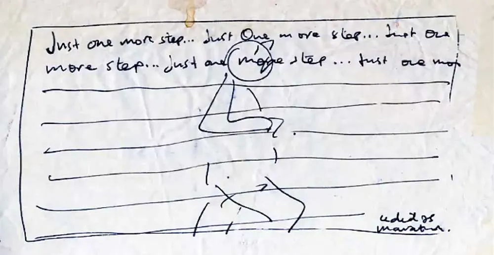
For context, at the time showing scamps of this poor quality at an early stage was common. A creative director wanted to make sure they were on board with an idea or headline before investing their creative’s time to make them look better. It took much longer to mock things up back then than it does now.
To be honest, I understand why. In this format it does show an insight, but it’s expressed in an pedestrian way.
But Dave Dye was convinced he was onto something that worked. So he stuck with the idea. He went looking in the agency archives for an image that might work, and ended up finding an image without a runner in it at all. It struck a chord, and he retooled the whole idea to work around the found image.
The poster below, that is the result of many revisions after that point, is meant to be part of the campaign above. The only thing that really fits is the typeface.
But it doesn’t matter. It’s a great poster, whatever the context.
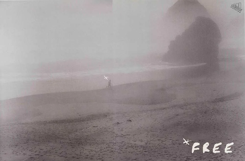
Another notable campaign that Dave Dye art directed was the below newspaper campaign for Adidas trail running. It’s hard to describe the impact of these ads. They were full double page spreads in newspapers. Enormously impactful when that was an incredibly important media for advertisers.
The choice of photographer was interesting. He worked with Sally Gall, better known as an art photographer. Not so much as a commercial shooter.
He was also considering a well known advertising photographer who also would have done a fine job. But Sally Gall showed such incredible enthusiasm for the project – sending thousands of words of thinking to Dave Dye by fax (anyone born after 1990 won’t know what that is – look it up). You can’t disregard that passion. So he went with her, and got these wonderfully moody and evocative images that strike the perfect note.
Let’s put it this way. If you are casting a role in a film for a doctor, it’s common practice to look for someone who looks like a butcher, or something completely at odds with the cliche of what a doctor is. Once you dress them in the clothes, they are going to look much more realistic. Because the truth is that real doctors don’t look like cliched doctors. They can look like anyone. Casting against type makes the actors look more authentic.
A similar principle can be applied to photographers and other suppliers. Perhaps a fashion photographer might find a different way of shooting a car than a specialised car photographer would. And the other way around as well. Taking photographers into new areas can create all kinds of exciting results.
In this case, working with an art photographer was exactly the right choice.
"If I cast the right actor, I don't have to direct them" - Alfred Hitchcock
Although Dave Dye is best known for his print work, he has turned his hand to tv ads as well. Later in this article we’ll discuss his work for PG Tips which really was a classic tv campaign.
But right now it is worth looking at an ad he made for Adidas during his time at Leagas Delaney. You can see his visual sensibilities at play, even in film.
The Economist “Red” poster campaign was one of the most celebrated advertising campaigns for many years prior to Dave Dye joining AMV. He came in to the agency and managed to get some posters approved that were part of that campaign. You can see they didn’t take a lot of art direction work, but wait a bit. The time would come for Dave Dye to put his unique stamp on the brand.
This is perhaps a good time to take a digression to talk about the Economist “Red” campaign and why it was considered so good for so long. If you are a junior creative coming into the industry, you might be wondering what the big deal was.
When the campaign began its life in the late 1970’s and early 1980’s, they looked like nothing else. The typical poster had glossy photography and punchy sell messages. These simple, cerebral posters stood out and made an immediate impact on the advertising industry.
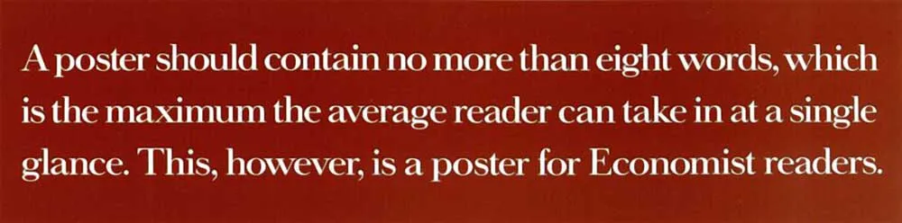
The campaign was so iconic, and so long running, that no-one had the courage to mess with it. The above posters were still being routinely awarded at the top award shows (more from habit than anything else, if you ask me, but that’s another matter).
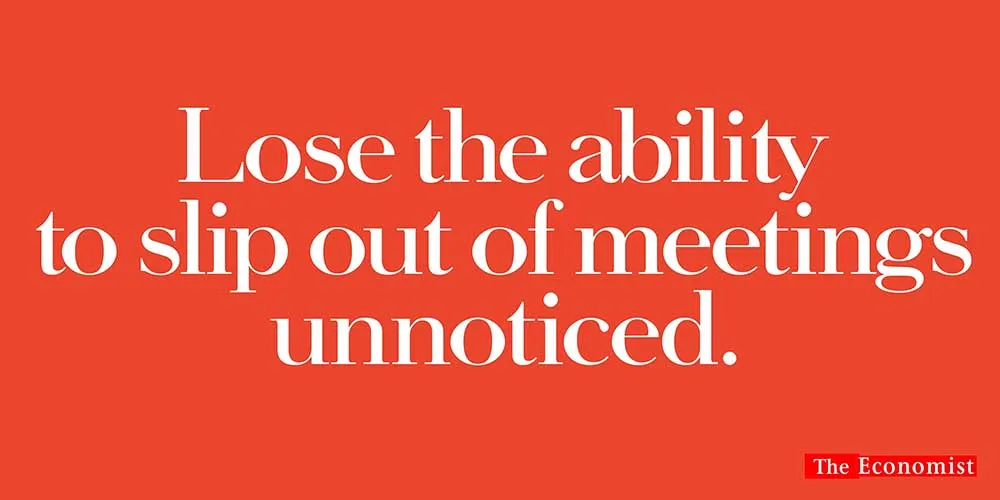
He was made creative director on the brand, and he immediately took the opportunity to see how it might be developed. He thought the ads were getting stale. And I think he was right.
He wasn’t arrogant enough to throw everything away and start again. There was incredible brand value in the colour red and the typographic style that characterised the Economist ads.
It would have also been unwise to throw away the cerebral, witty tone of voice that the advertising had anchored itself about for twenty years.
The goal was to re-invent the page. Bring some novelty to the visual dynamic, and thus their message.
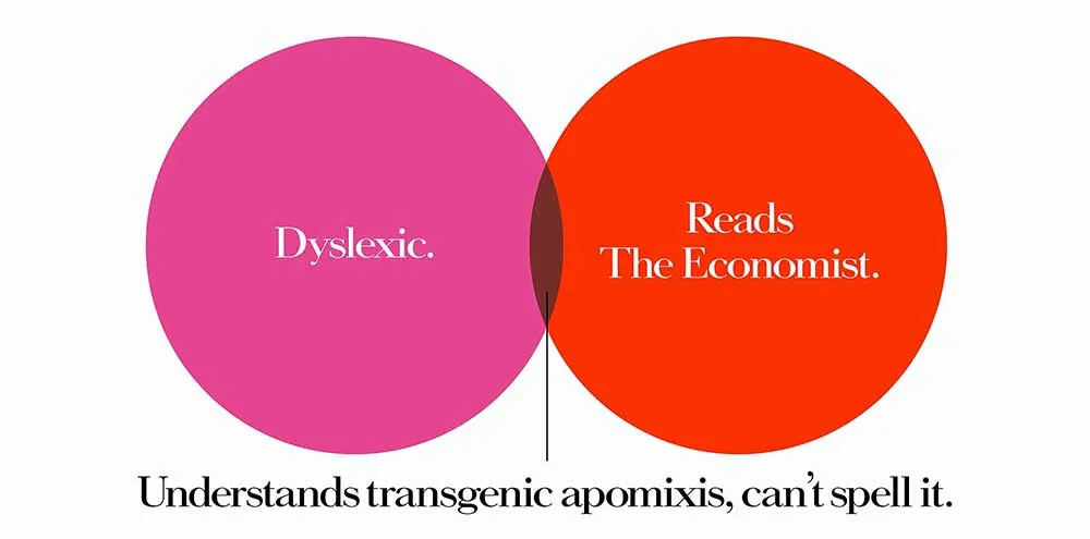
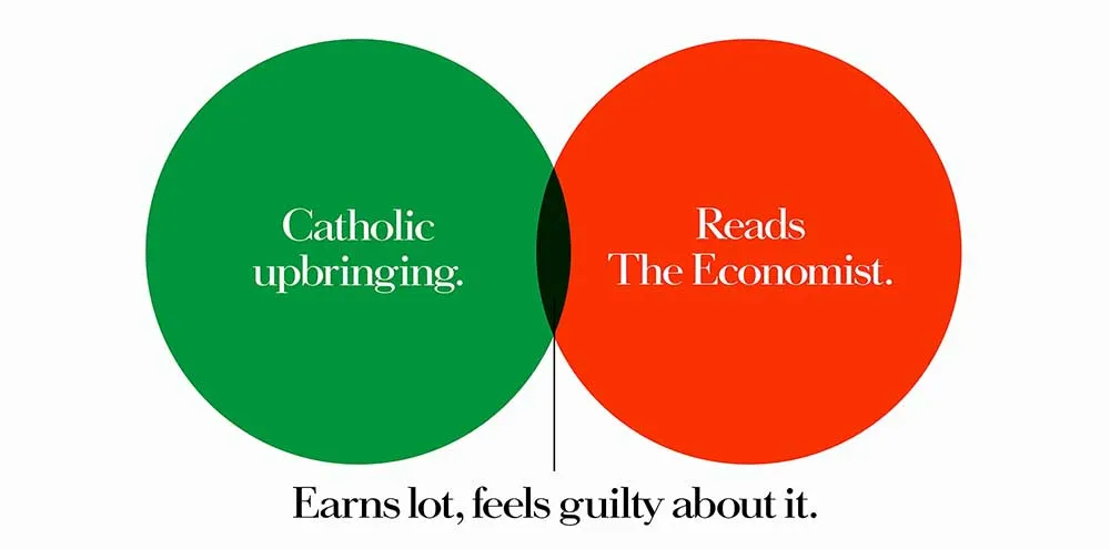
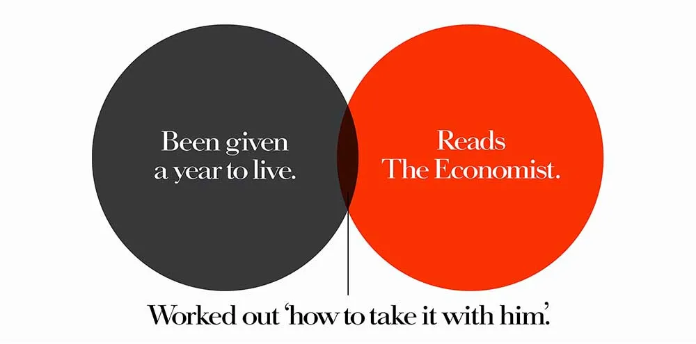
The Venn diagram ads below is what resulted. They still look like the economist ads of old, but with a tweak. It’s a perfect example of how to evolve a campaign without losing what was good about it. I’ve only included three, but there was a bunch of them – mostly running on train platforms in cross-track locations.
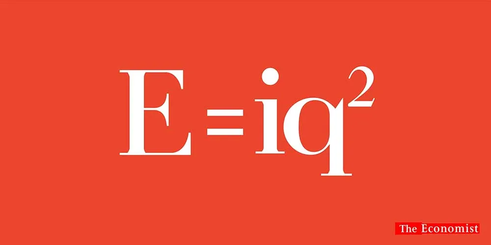
Next came a tough brief – the Economist in color
It doesn’t sound like a tough brief. But it is if you have very high standards and a client that expects you to reach those standards everytime.
This is a story of five campaign presentations that failed, and one that succeeded. And the one that was bought after six presentations was the best one.
More often than not, if you’ve gone back to a client six times the work is not good. It’s been compromised, overthought, overworked and everyone just wants the project to end. But not if you’re a great creative working at a great agency.
The tension at the heart of this brief is keeping the cerebral, witty tone of voice for the brand while delivering a very functional benefit. The brand promise was never functional. The economist never promised great photography, or talked about their convenient size. They promise that it will make you better informed and more influential. But the brief said what it did, and the agency needed to deliver.
And deliver they did.
Dave Dye kept it cerebral by turning it into puzzle. It got the message across, and kept the brand’s promise that it’s the magazine for smarter readers.
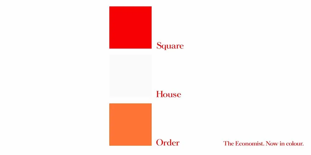
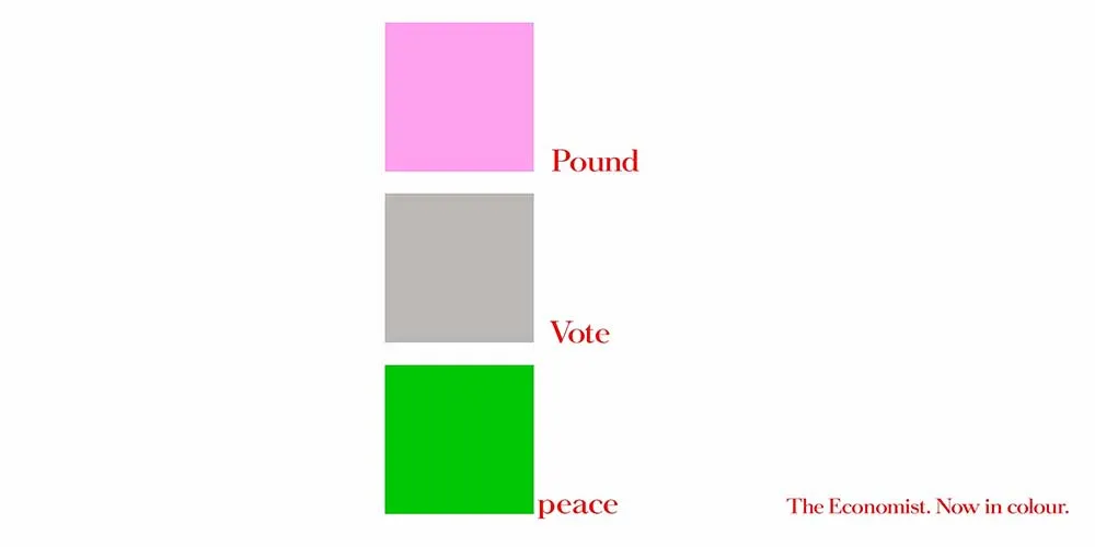
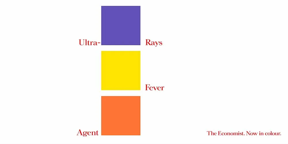
Thanks to Dave Dye, the Economist was never the same again
The work for the Economist has continued to become more graphically adventurous. But they still feel like Economist ads. They have become an exploration of color and shape – but they still tell the story of the Economist.
Part of me is wondering why I am sharing this work with you, because long copy print ads like these aren’t very relevant to a junior creative. Print ads have become an afterthought. But back when these incredibly crafted ads were made, they were very, very prestigious.
They would often be the backbone of an advertising campaign. But those days are gone. But if you appreciate people pushing themselves to the limit in the name of excellence, the story of these ads are remarkable.
English Heritage maintain and promote castles and important historical sights
The decision was made to create individual ads for different sites around the country. So, storytelling was important.
It was quickly decided that since there were so many interesting stories and factoids at each location, a layout would need to be found to tell those stories, and give readers a taste of the depth of history at each site.
I’m going to show you two layouts first, then discuss some interesting details about them below. (There were more ads, but they worked to the same layout).
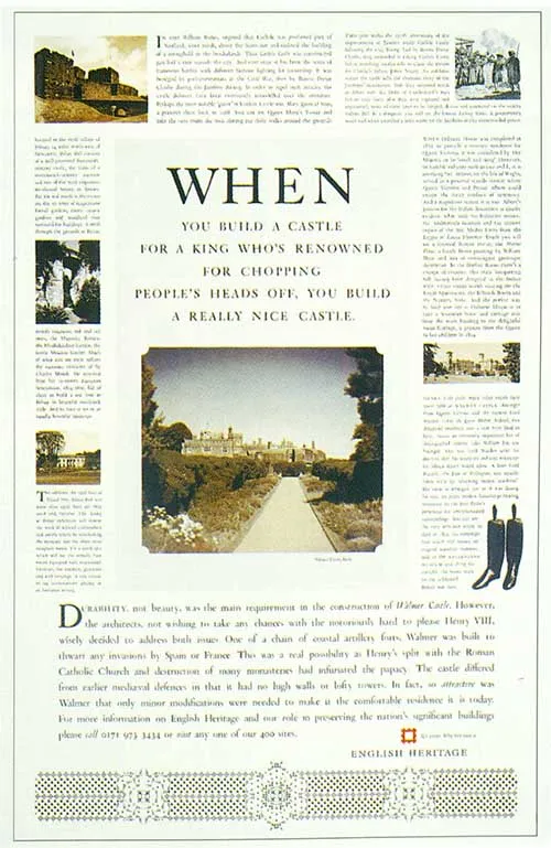
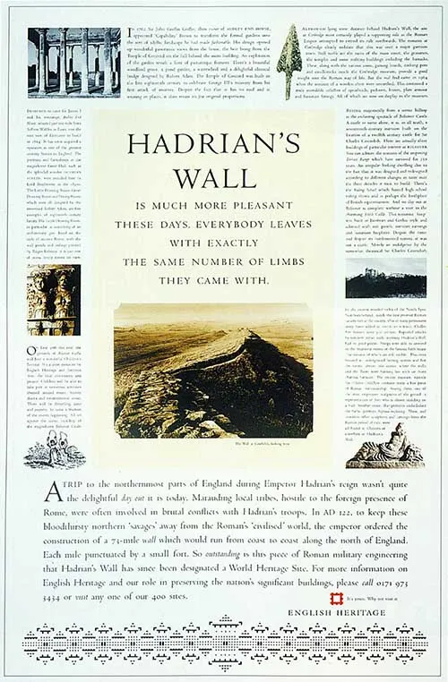
The header section is slightly to the left. That was deliberate. Dave Dye noticed that they just felt too geometric and static when they were in a stricter grid. Loosening up the grid, while keeping the typography tight was a brilliant solution.
Also notice the typography. Dave Dye is an art director, which means that he had the assistance of a specialised typographer. Together they decided that the typefaces used in each ad would be relevant to the location and the period it was built in.
There is no campaign font. It changed for every single ad. But he gets away with it – because the design grid is consistent. It’s a design decision that not many art directors would have the courage to make. But Dave Dye pulled it off beautifully.
The impeccable base graphics
You might think that each of the base designs came from an antique type specimen book. Not so. Each was designed bespoke for each layout. And each contain deeper meaning that relates to each site.
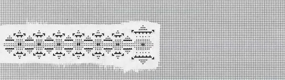
For instance, the Hadrian’s Wall ad shows the exact amount of sentry towers that were built along the wall. The larger one in the middle represents the main sentry tower along the wall.
Each was hand drawn on graph paper as above, but only after being thoroughly thought through and considered for historical accuracy.
They look fantastic. And it is a bitter shame that the meaning of the designs was never more widely known. I’d imagine if this was made today, there would be films made for social media discussing the meaning of each of the designs. Perhaps they’d be animated.
This kind of craft can trigger an enormous amount of content ideas that can leverage the brand and the message. So, why not put some craft into your next campaign – social or otherwise – and leverage it’s story for the benefit of your client. And your portfolio too, of course.
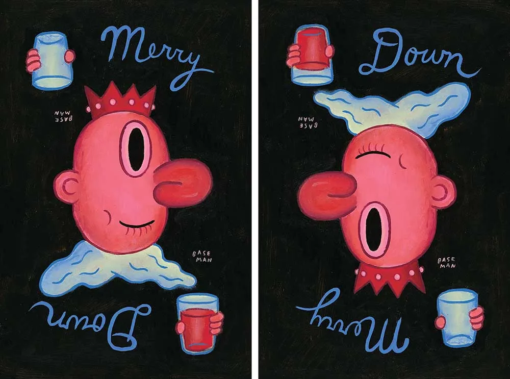
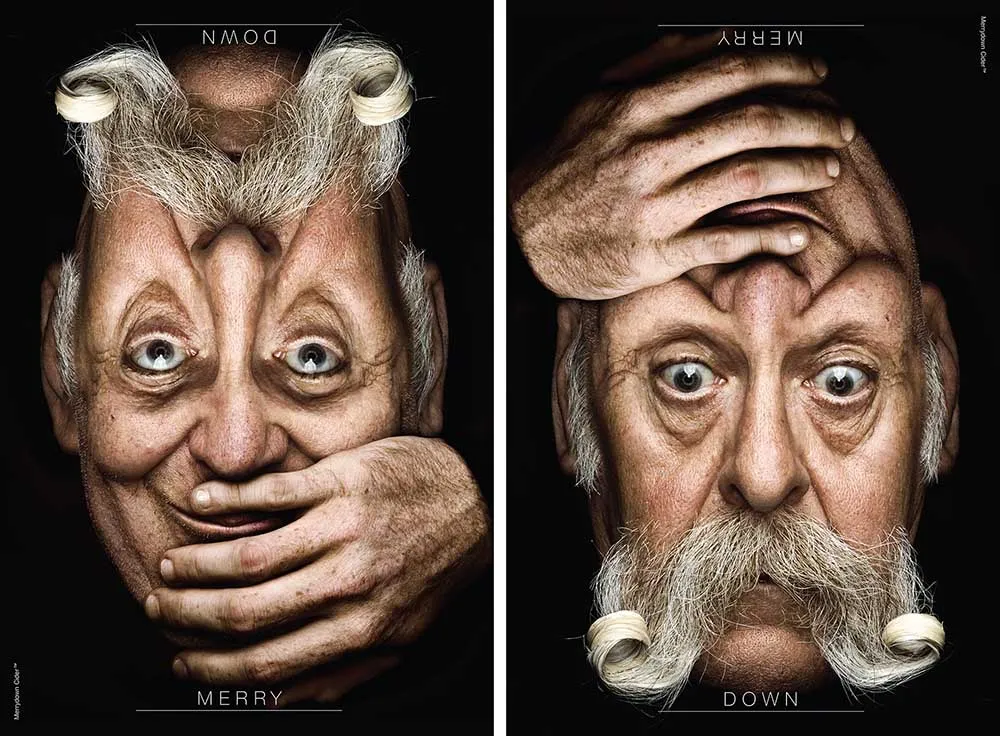
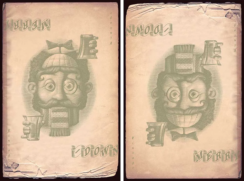
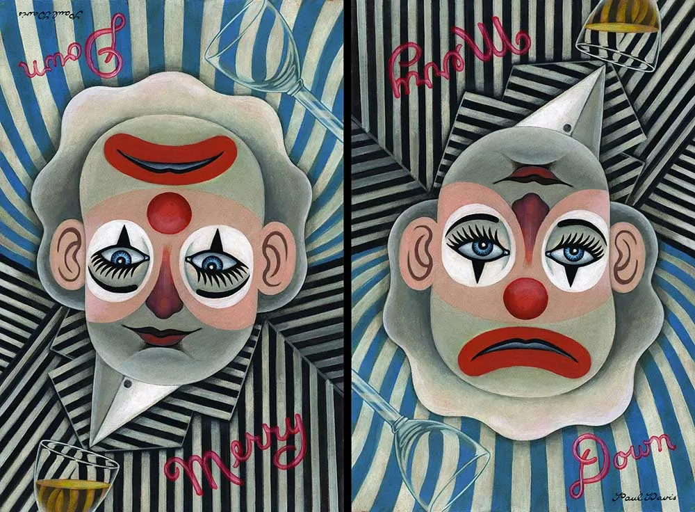
Merrydown cider was a well established brand. But it had lost it’s lustre. It’s audience was aging, and they felt they were losing their relevance.
Previous ads talked about the quality of the cider, or the production process.
But Dave Dye had an immediate revelation when he saw the brief. A product name that has ‘Happy’ and ‘Sad’ in the same word.
He also remembered antique victorian illustrations where a head would change from happy to sad when the page was flipped over. The solution presented itself.
Merry: A happy face and a full glass.
Down: A sad face and an empty glass.
He selected ten of his favorite illustrators and image makers, and got them to work. Each providing their own take on the idea.
If you want to appeal to younger drinkers, it’s easy. Just. Be. Cool. Don’t say you’re cool. Or show pictures of cool people drinking your product. Be cool. Do cool stuff.
There are dozens and dozens of these posters. Here are just a few of my favorites.

Why a monkey? Well, why not?
Many brands will recruit a celebrity or a spokesperson to represent their brands. Which works incredibly well. But over time they get very expensive, and there are risks involved as well.
People get involved in scandals, fall out of the limelight, might not be available when you need them. But a sock-puppet monkey? Well, no problems with that.
The choice of a monkey was actually historical. PG Tips originally made ads with real chimpanzees dressed up as people. Yes, really. But when that became inappropriate, there was a decision to make. Either start something completely new, or find a charming way to develop the campaign onward.
Yes, this image below is a still from one of the original ads.
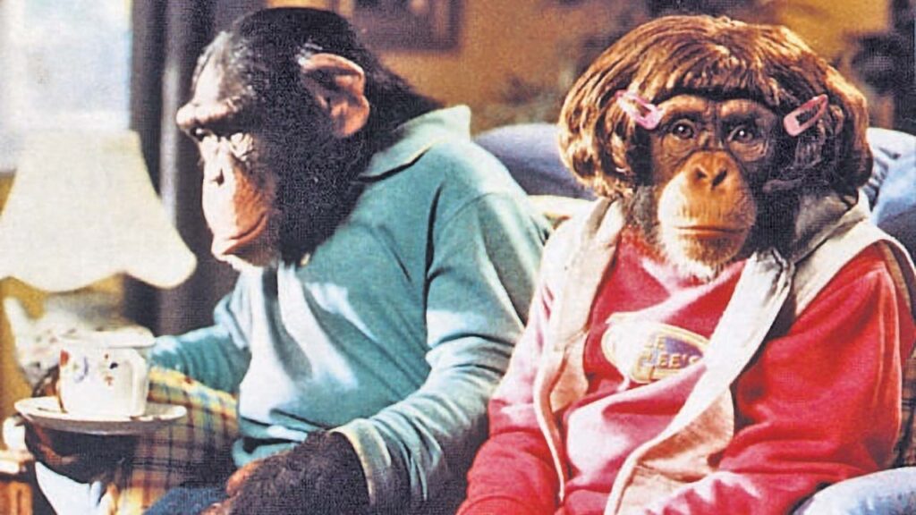
And that’s why the sock-puppet monkey came about.
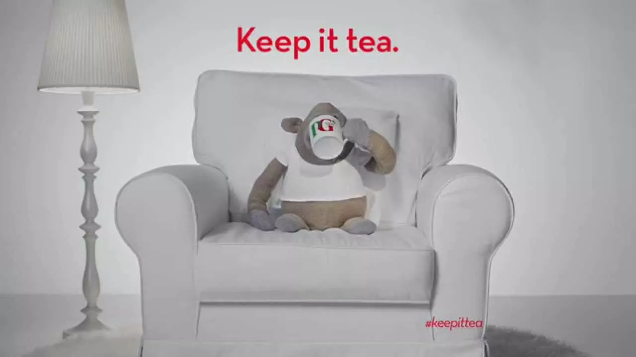
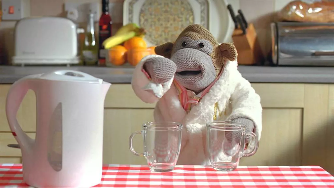
But what sets mascots like monkey apart, is when creatives take the time to give them a warm, relatable personality. But still keeping them interesting. And that’s what Dave Dye did here.
The line of ‘Keep it tea’ is a way of saying keep it real. Tea is a down to earth drink. He is making fun of the pretentious things going on. He is the monkey of the people. These are the ads below that launched the Monkey campaign.
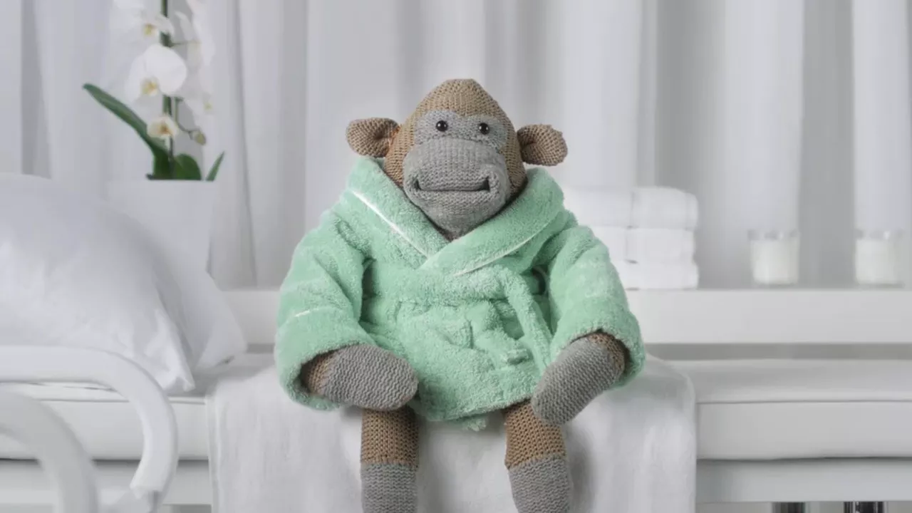
So Dave Dye developed the campaign with more sophisticated storytelling. He gave him a suburban home and a life, and filled it with the common dramas of the everyday. Dramas to which the answer is always tea.
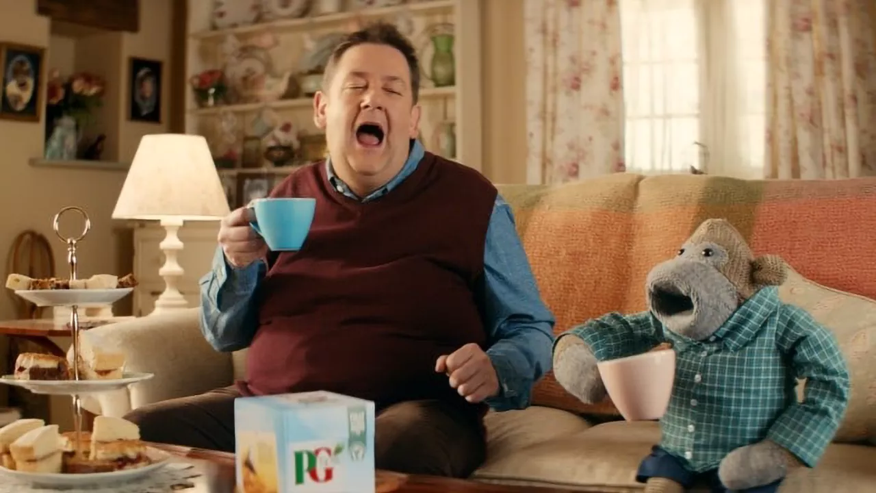
Often, it’s the ad agency that gets bored of a mascot more than the general public. Which is why agencies always convince clients to try something new.
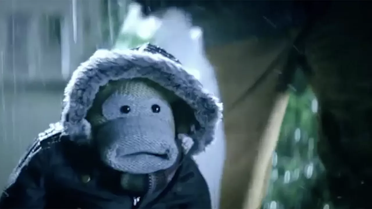
It is our own desire for novelty that can ruin a great thing. Dave Dye knew this, and decided to introduce comedian Johnny Vegas to the mix. Which created some of the best PG Tips advertising ever. See below.
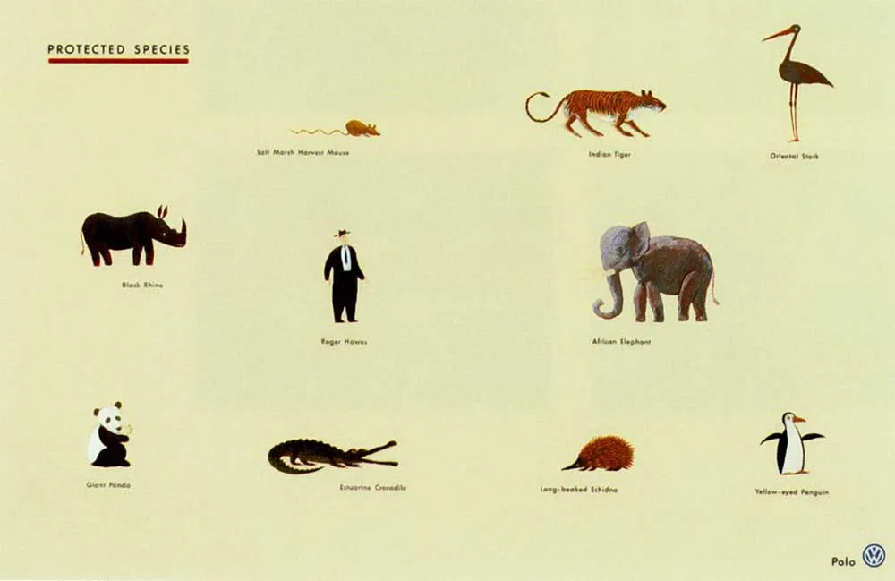
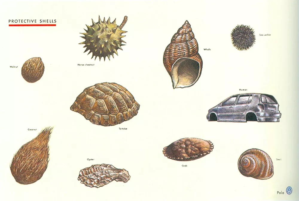
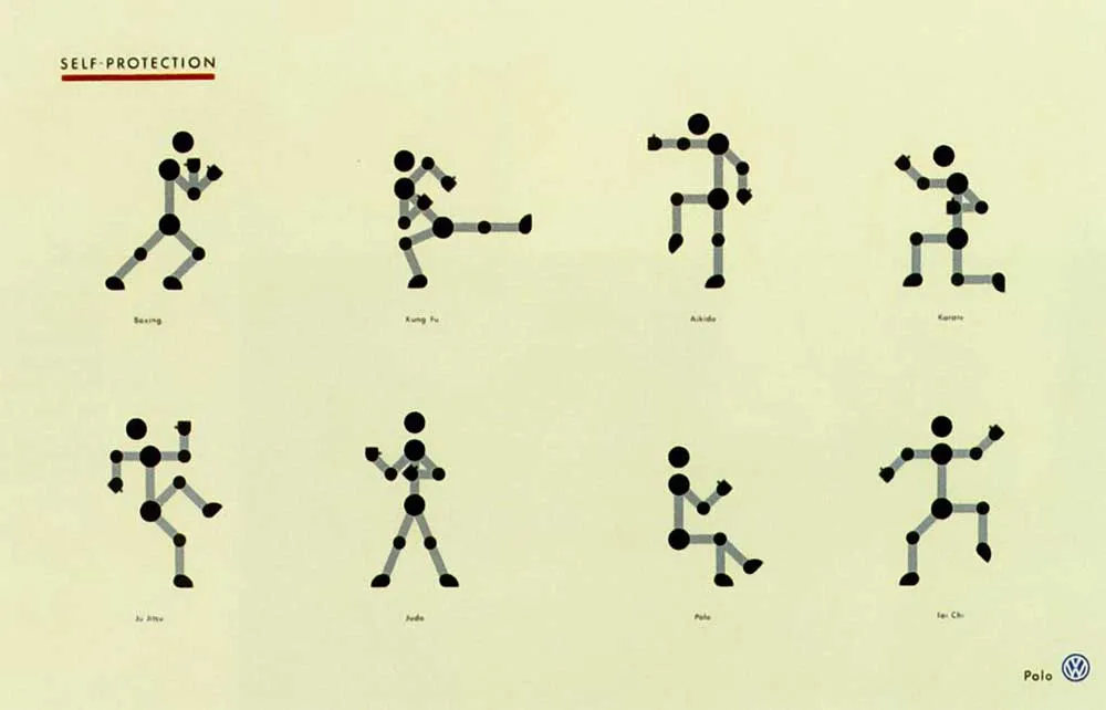
Dave Dye has a mantra. Don’t advertise. Communicate. There is perhaps no better example than these Volkswagen print ads.
If he was advertising the Volkswagen, he would have a shiny image of the car looking magnificent as the central focus of the ad. And then have his writer create a line that speaks to whichever feature the client was wanting to promote.
But when communication is your primary focus, you don’t make those assumptions. Instead, Dave Dye begins with the message – and looks for the best way to communicate it to the audience.
These ads don’t look at all like car ads. Which is why they work. They charm the reader into understanding that Volkswagen make incredibly safe cars. Job done. And job done brilliantly.
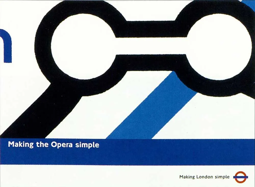
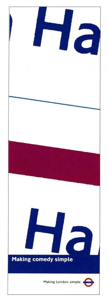
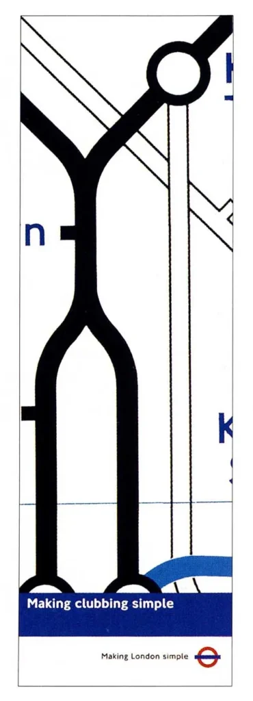
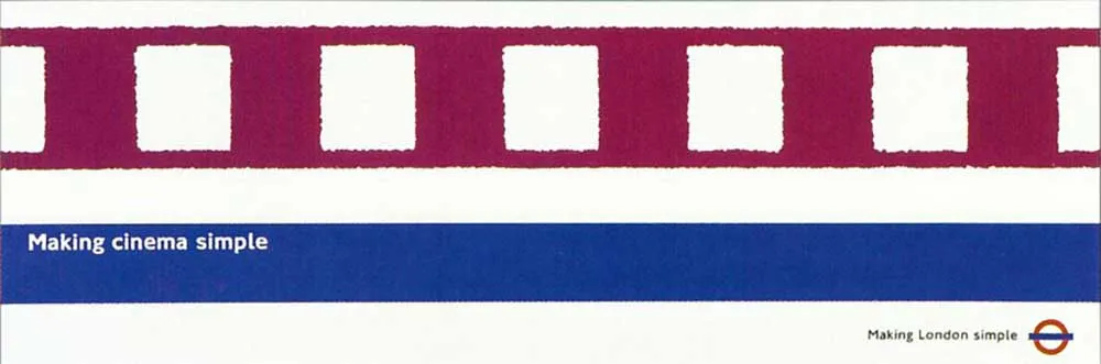
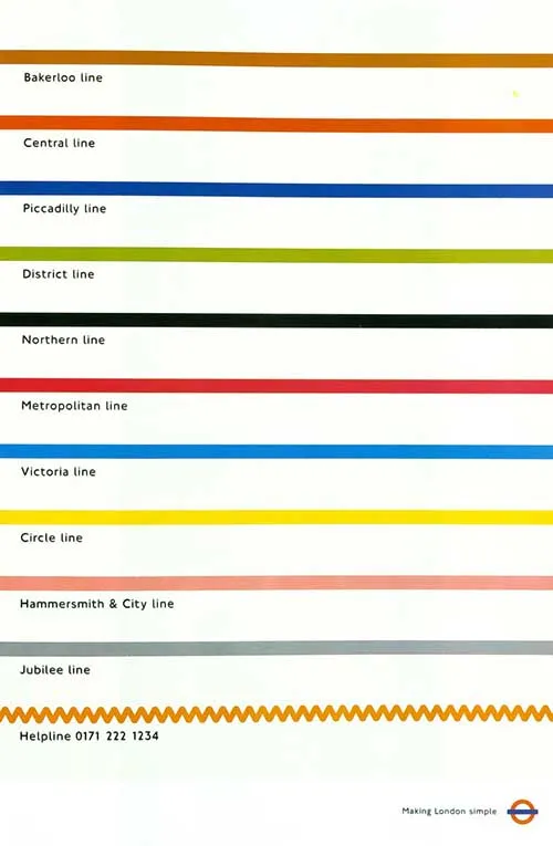
The London Underground (the ‘Tube’) is one of the most desired clients for creatives to work on in the UK. They have a history of appreciating and buying great work.
Dave Dye put his own stamp on the advertising with this ‘Making London Simple’ campaign. Using the famous London Tube map as a reference, he found interesting shapes that brought the layouts to life.
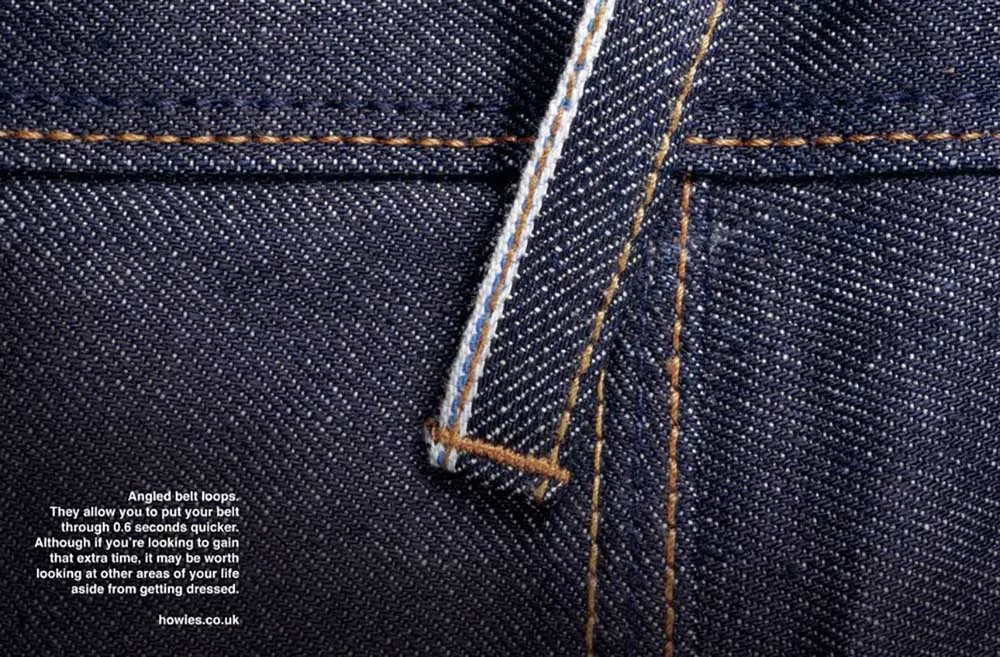
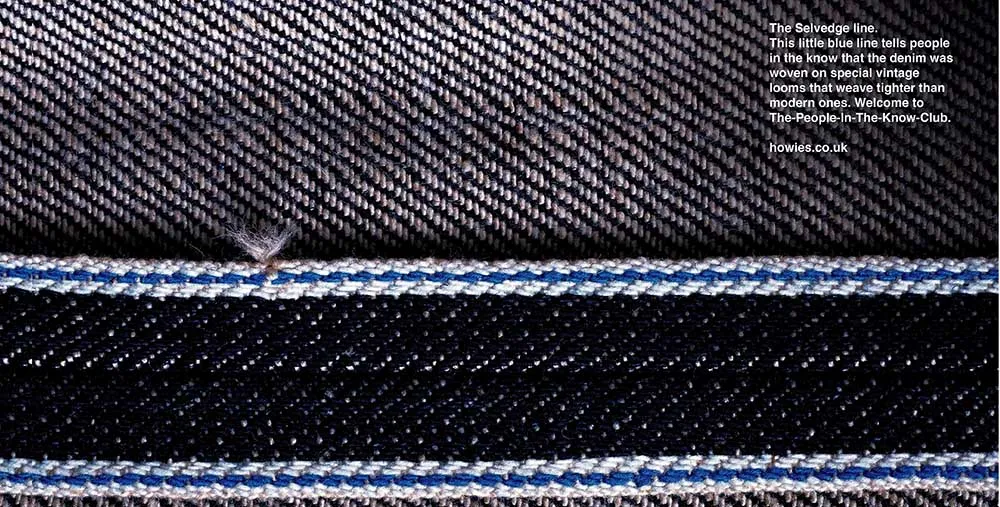
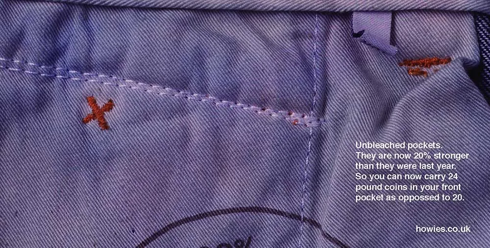
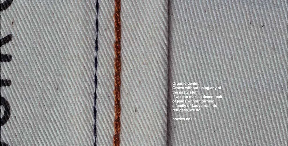
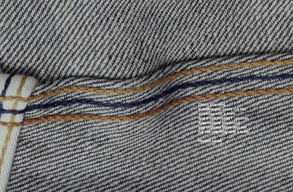
Howies was an outdoor clothing brand started by a copywriter, Dave Hieatt, that Dave Dye once worked with. He actually wrote some of the adidas ads at the beginning of this profile.
But this wasn’t just a side hustle by Dave Hieatt, it was a growing brand that was gaining a lot of traction in the market. It was a brand that operated in the early days of the internet and was one of the first that really understood how to market clothes online.
To get to the next level of growth, advertising was the obvious path to take. But Dave Hieatt was concerned that advertising was going to jeopardise the ‘underground’ feel of the brand. He was worried that his most dedicated customers would think Howies had ‘sold out’.
Dave Dye came up with this campaign that deliberately didn’t look like ads, that were written with a cheeky, offhand tone of voice. They worked great.
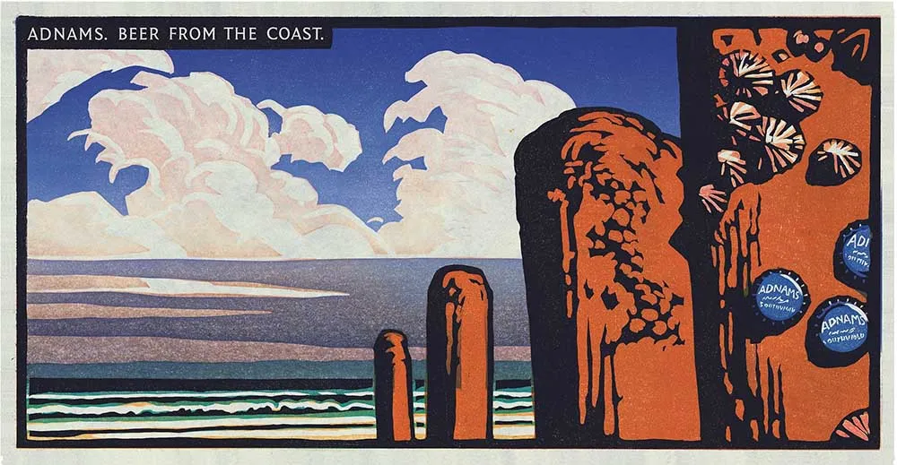
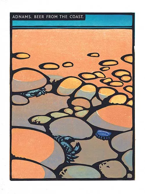
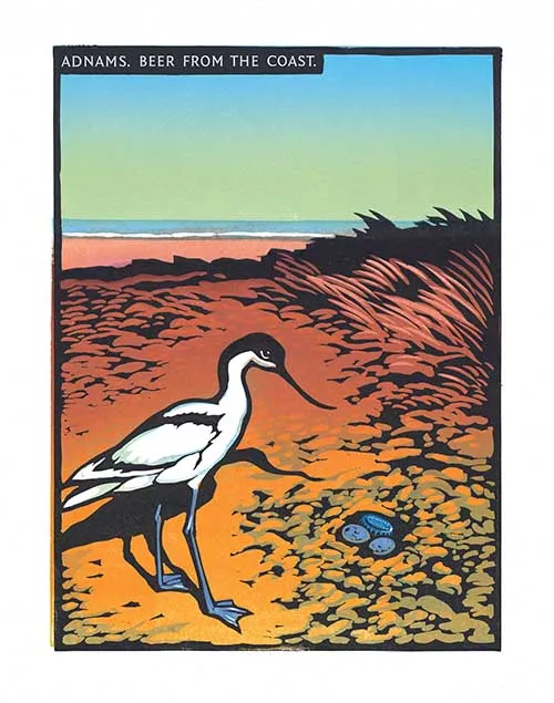
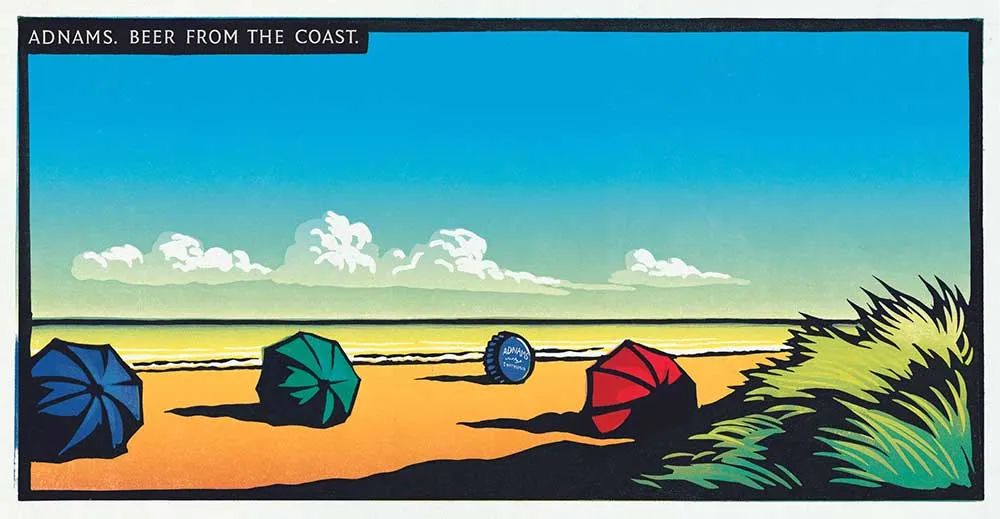
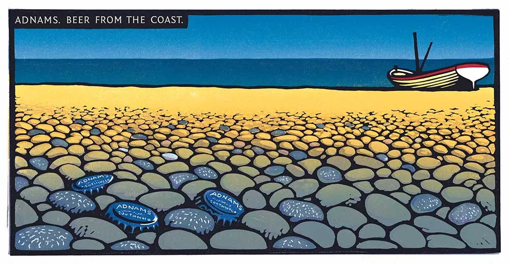
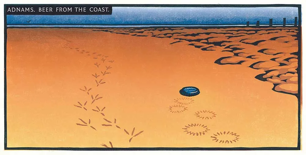
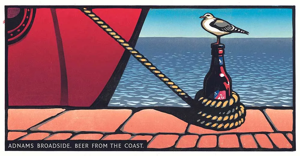
Adnams, at first glance, is just another beer. For a long time their advertising focused on ingredients, production and other beer label cliches.
But on a factory tour when his agency was beginning to work on the brand, Dave Dye noticed that the sea was nearby. Literally just down the street. “Perhaps it isn’t that hard”, he thought. “Why don’t we just say it’s the one from beside the sea?”
Because you are saying something different about your brand than anyone else. The romance of the seaside. The fresh air and uncluttered beaches. Taking a sip of Adnams is almost like being on holiday.
He looked into old ‘seaside holiday’ posters to find the style. Photography wasn’t the way to go. He don’t want Adnams to look like a new, slick beer from the coast. He wanted heritage. A harkening back to a more idyllic era.
I hope you agree that he chose well. These illustrations are still being used today in the Adnams factory gift shop on t-shirts, coffee mugs, tea towels and beer coasters.
Dave Dye didn’t just create an ad campaign. He actually created a USP (unique selling proposition) for the brand that endures today, and has been wildly successful for their business.
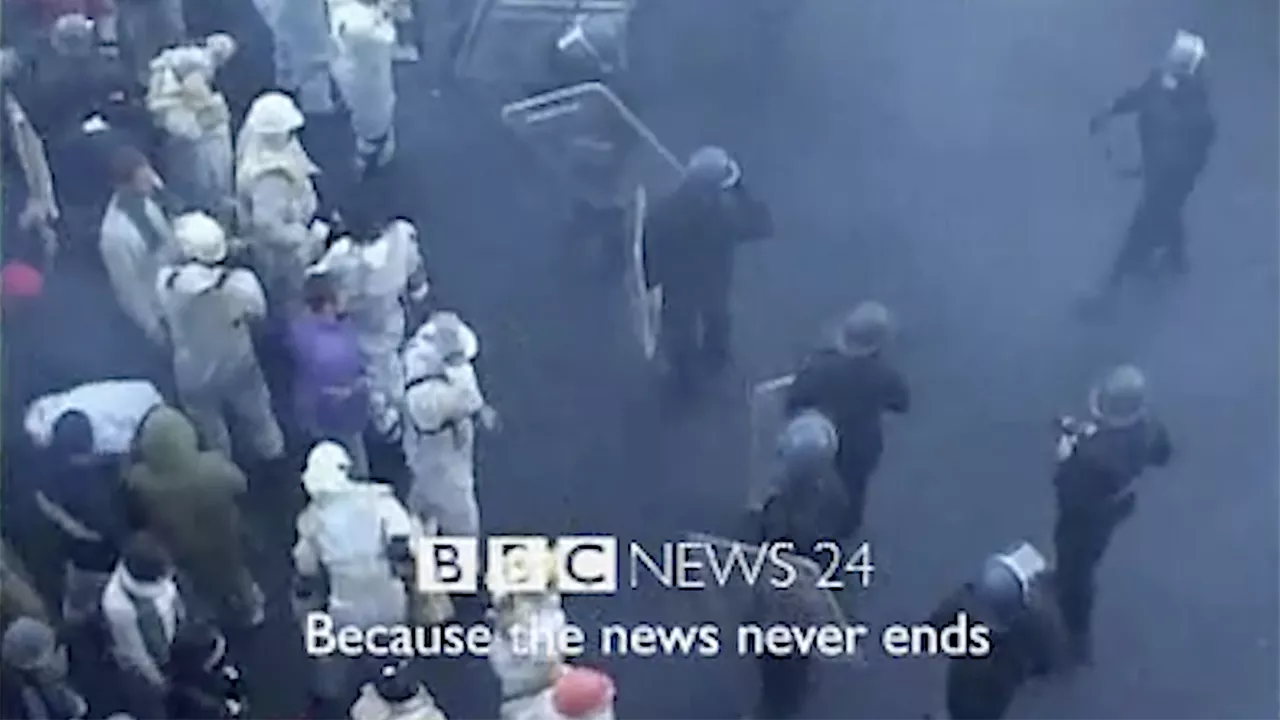
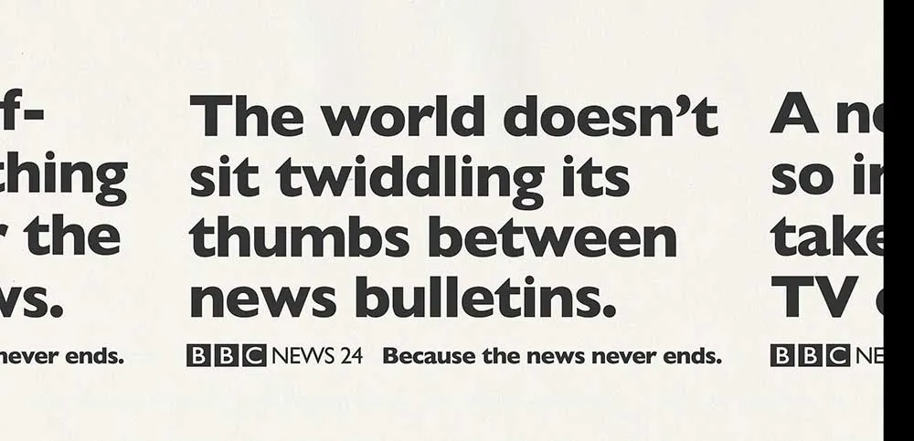
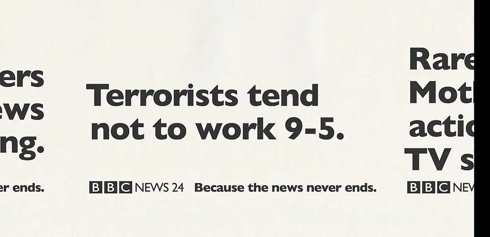
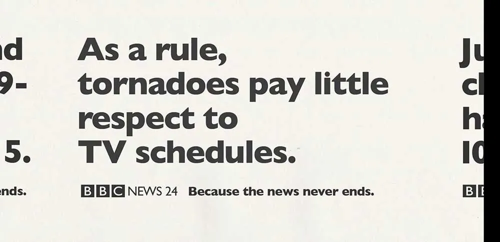
For the launch of BBC News 24, their 24 hour news channel, the creative team came up with the idea of ‘the news never ends’.
There is a tv ad, which you’ll see first, but take a look at the way Dave Dye designs the page. They are simply headline ads, but he does something different and distinctive with them.
As well as appearing insider the D&AD annual regularly, Dave Dye has also had the prestige of designing the annual itself. Not once, but twice.
The second annual he designed, for the 50th anniversary edition, is a great story. The design was actually a competition held between some of the most esteemed creatives in the UK. Even being invited to compete was an impossible bar to clear.
What made it even more difficult was the fuzziness of the brief. “The Power of Creativity”. If ever there was a brief written by a committee, this was it. It is such an open brief that it essentially means nothing.
Dave Dye struggled with the project on and off for weeks. Until he had an insight. Perhaps his difficulty in addressing the brief was the idea itself.
So, when he was on a flight, he wrote a stream of consciousness on a flight. Not understanding the brief was the idea.
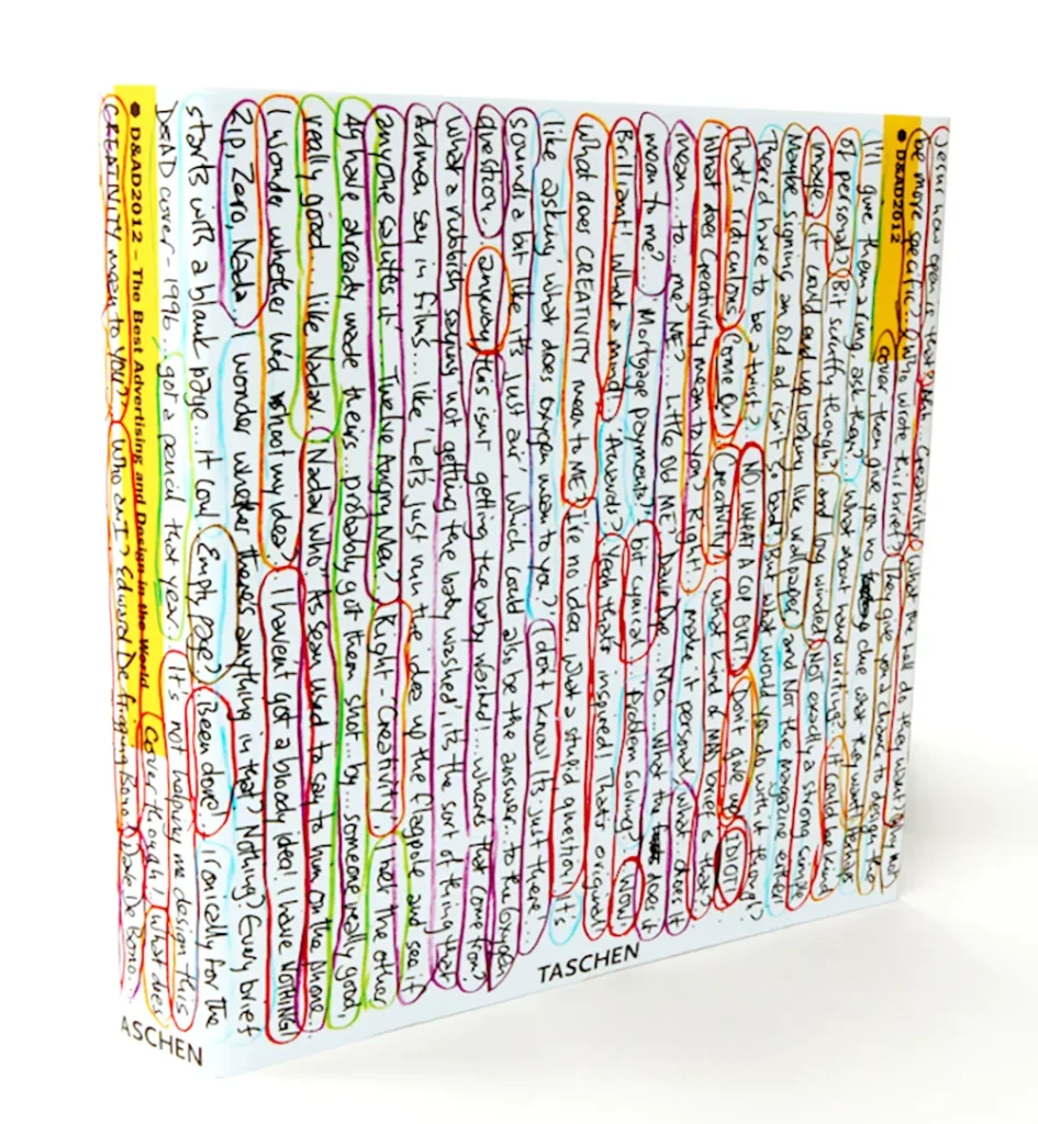
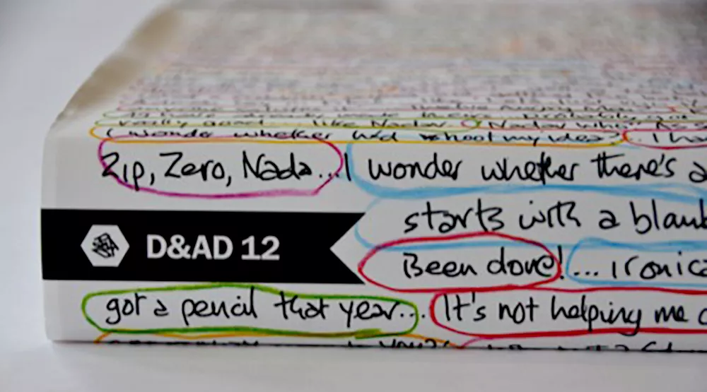
It took a hell of a lot of work to get to this design. He took his original text, cut it up and mixed it up. Tried different types of typographies and color codes.
He writes about the process in detail on his blog, and it is definitely worth a read. It’s a brilliant lesson in resilience, perseverance, and not being satisfied with close enough.
Being willing to go through this torturous process to reach for excellence is exactly what makes him great.

The best guide. Undergrad, portfolio, grad incubators and more.
Subscribe to our email newsletter today to receive updates on the latest news, tutorials and special offers!